Friday, 30 May 2008

Yet More on Displacement

Well - you all seem to be keen on carrying on with the Displacements. Lovely lot of messages, it’s so encouraging. I have made a resolution to leave more messages on the blogs I visit - don’t always have time.

Marian - I’ll let you know how Clive gets on. He is doing some great abstract landscapes with charcoal at the moment but he won’t let me put a pic up yet.
Had a look at your blog, Susan - loved your animal markings. Pippa - I don’t want to be cited in your divorce papers, so cook him a meal now and then.

Arlee - get loading and Artisue thanks for the good wishes. The gesso piece was just cast paper stuck on cartridge paper, painted with black acrylics and gessod when dry. Then spray painted. Must get back to that - I spent most of yesterday on the phone doing admin and stuff. I also have a great excitement in the wings but I’m keeping quiet until it is finalised, Ooh, I wish I could tell you!

Hi Tom. So sorry about the new nickname. You used to do loads of computer design - do you still do it?

So good to hear from Annabel - love the stuff on your web site and the bit of ‘headology’ relating to it. Clive used to write poetry while I drew and that was quite companionable. He hasn’t done that for ages - I won’t ask why because he’s probably too busy with all the web stuff. My fault.

Sonja - I had forgotten about Arithmetic in PSP7. It is more like Layers than maps as it merges two images using a form of blend mode. Great with a gradient all over a page, as we were doing yesterday.

Jackie - keep on with the fun.

On with today’s Displacement Activity which involves displacing part of the screen only.
Fill a new page with a gradient. I used this one.


Displace with a suitable image. Here’s my Sissinghurst poppy.


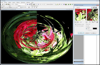
This is the result. Save as you go along, by the way.


Open an image containing words to use as a map. The indispensible Clive also does calligraphy and this is a sentence or two of his which I cloned into a ‘manuscript’.
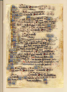

Draw a rectangular selection box around an area of the poppy design. Then go to the displacement map and choose the words image. The changes will only appear in the area contained by the select rectangle.


Use the clone tool and a soft, fuzzy brush to smudge the hard edges around the
text.


Now for more fun.
Go to the layers menu and duplicate twice so you have three layers with the same image. In the layers palette (go to View, Palettes, Layers if you can’t see it) click on the top layer and go to Effects, edges, find all. It will look strange.
Still on the top layer in the Layers menu, reduce the opacity to about 50.
Finally go to Effects, Texture, Sculpture and choose this option.
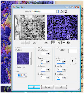


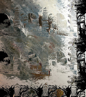
Now spend a few hours changing the Blend Modes - big fun. The one below shows Difference on the top layer.

Tuesday, 27 May 2008

Lots of Pics


What weather, yesterday, for a bank holiday Monday - it poured all day. Sunday was lovely and we went for a massive walk. We hope to move house next year (if the market collapse allows) and I’ve not taken on any teaching in 2009 to allow for this. Will still be doing lots of talks, though. We don’t plan to move far but we’d like a nicer, slightly smaller house. It was interesting to brainstorm the necessities and we discovered that our main one (apart from sufficient room to sleep and work) was to live near some good walks so that we didn’t have to get in the car to go for our exercise. We are lucky here to have good walking nearby and wouldn’t want to lose it. Having a food shop close by has moved to the bottom of the list now that Mr Tesco brings it in a van! On the other hand we don’t want to live in the depths of the country and be totally dependent on a car.


Having identified an area, we have been researching the walks and, as we keep getting lost, the coffee shops for unexpected lunch stops. So that’s what we did on Saturday and Sunday and now my legs really ache.

Yesterday we polished up Quiltwow (WoW is ready) and I did a lot of messy gesso, some for the next book but some was just for fun. My design to stitch book is getting quite full. Here’s a gesso and cast paper section - not a good photo as it is too shiny to show the detail.


Clive, having finished his OU studies, has enrolled on an Open College of the Arts Drawing course. He has excellent drawing skills (he used to be much better than me at things like figures and wild-life) but hasn’t done any for so long that he wanted to start all over again. He has had his first assessment back and was very encouraged. I do find that drawing needs to be done frequently to keep the hand and eye in trim. So, there we are in the evenings, like Darby and Joan with our sketch books on our knees. Mine has to share my lap with Stevens which makes for interesting impromptu lines and I can’t recommend a cat as a drawing board.

I didn’t post the pics from the Marlborough course so here are some of the goodies. They were a wonderful group and we had such a fun day. This is by Dale.


Here’s is Maggie Harris (The Other Maggie) using a design from her sketchbook.


Work in progress.


Are you fed up with Displacement Maps yet? Let me know because I have other ideas for later blogs. Here’s a goody. Fill a blank page with a colourful gradient using the fill tool.


Then displace this image with a displacement map. I used a photo of a poppy from our Sissinghurst day.


Duplicate three times in the Layer menu and then click on the top layer and go to Effects and Edges - Find all. Finally, reduce the opacity on the top layer.


Love that pale effect. Now play with the blend modes - this is Difference on the top layer only.


Friday, 23 May 2008

Displacements using Photoshop

I am feeling much better than I deserve this morning as I over-indulged in some really good wine last night. Only about three glasses but that is two more than usual. It seems to me that, as you get older, your vices give you up! I can't eat, drink or otherwise indulge in excess these days.

We had some friends over and I actually cooked a proper meal (they are good friends and understand our chaotic lifestyle, so can be offered a take-away). Played on the wii and generally caught up so it was a good night. And no headache, so I can do some messy work today for a WoW article.

Meanwhile, on with the displacement maps. Thanks for the comments - glad it was useful. Yes, indigocarole, you need PSP 9 or higher for the displacement map filter.

This is the Photoshop Elements version. I don't find it as good but I am willing to be corrected. I like lots of things about Elements but it is never my first choice.


Using the Peony pic as my main image.


...and displacing with this fossil design. I have to make sure that the image I'm using as a map is saved as a .psd file and that I know where to locate it.


Then go to the Filter menu and Distort, Displace.


Increase the size to 100 in each box (try different options here). Say OK and you will be asked for the file name of your map.


Here's the result.


Looks better after a few more filters - such as inked edges etc.


That's it folks. Gesso - here I come.

Wednesday, 21 May 2008

Life is Just a Bowl of Roses

It was a wonderful day out at the Marlborough workshop yesterday and some great work was produced. More on that tomorrow. Today is Displacement Wednesday. I’ll use Paint Shop Pro 9 (10 doesn’t behave well on this Vista machine for some reason and I refuse to keep buying new software). I’ll try to look at Photoshop Elements tomorrow.

Here we go:


Open the Image you want to use. Then open two or three others to use as maps. The best ones will have good areas of contrast and not too much texture. Not every image will work so give yourself lots of choice. Every image you open will show as a possible map.
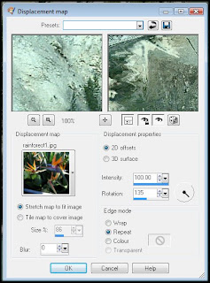
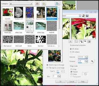
Look on the Menu bar for Effects, then Distortion Effects, then Displacement Maps. You will get a menu like this one.


Make sure that the settings show the following. Stretch map to fit, 2D Offsets, Blur is set to 0 and 100% Intensity. Other options can give good results but these are best to start with. The thumbnail shown under Displacement maps will be the image you want to displace. Click the arrow at the side of the thumbnail and you will see all the maps, including your own images. Click on the map you want. If you have the eyeball icon clicked, you can see the result on your image. I always use the locked eyeball, too.
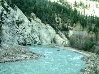
This is my original image - a Canadian Landscape.


This was displaced by this photo of bird of paradise flowers.


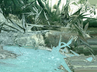
Here’s the result using the settings shown in the box above. Note that the colours of the landscape remain but the shapes are those of the plants.


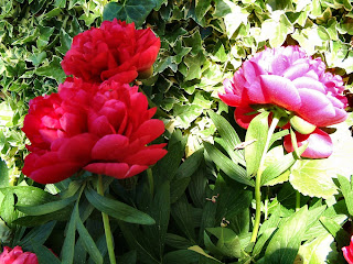
Lets try the same map - the birdy flowers - on a pic shown below, some peonies currently blooming in my garden.


Here's the result, using the same settings as before.


Now try changing the rotation. Either type a value in the box or drag the ‘clock hand’ around. Check the results.


Then try changing the edge modes - Wrap. Repeat and Colour. Change the colour and note the difference. Black or white add drama.


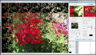
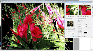
Now change 'Stretch to Fit' to 'Tile' and put a value in the box below. Try a low one to make small tiles, as shown below.


Hmmm. Not too interesting - although it might be with a different image. Giving it a big value makes it bigger than the original, like so.


I like this image. Always work on into your images with further effects - the above image with ploar Co-ordinates used (in the same Distortions menu).


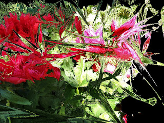
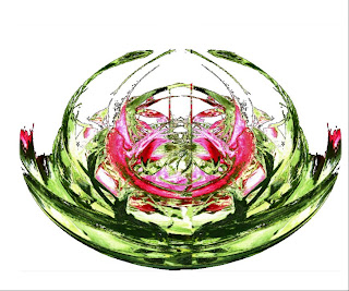
Finally, the above image had the more interesting half selected using the rectangle tool. I then pasted the selection on a new page, pasted it again and mirrored the image. A little tidy-up with the eraser and here's a bowl of roses!
Let me know if this has helped.


Monday, 19 May 2008

Grrrrr!

Don't you just hate days when nothing works? It's not even eight o'clock in the morning and my workroom lights refuse to work (Clive is muttering in the garage with fuses and trip switches). Blogger still won't load my pics and I can't find a vital piece of work for tomorrow's class. It can only get better - can't it?
8.30 am and it has got better - the lights work and I can load my pics on Clive's machine. Still not on my laptop - how weird is that?
Anyway, to get back to yesterday. Thank you so much for your lovely comments about the talk. Pat. It cheered me up no end (the cat is ill again) and I thought your comment on your blog that you thought of computer design as cheating, was very interesting. I don't think of it like that at all as I always take care when composing photos or else I scan my drawing in. What I don't like is when it is very obvious what effects are used - so always use several on top of each other or fall back on our good old Displacement maps.
Had some emails about how to do Displacement maps so I'll do a tutorial step-by-step on Wednesday. I think I have done this before and it's my fault for not adding the right notes to the blog.
Here is a pic from Sissinghurst of the white Wisteria.
.
.
And a closer shot of the flowers, using the Layers and duplicating the pic. Then adding a new layer and putting a colour wash over with the fill tool.
.
.
Changing the top blend mode to 'difference' gives this great design.
.
.
and then putting it through the Polar Co-ordinates effect.
.
Here is Kathy from Kent's lovely bag, based on chimneys. See yesterday's post.
.
.
And a detail.
.
.
Back to the preparations for the Marlborough workshop.

Sunday, 18 May 2008

Motorway Musings

Blogger won't let me put any pics in, I'll try later this afternoon so please do come back again.

Later, the same day, (this is getting to be a serial blog) - still can't load pics and I've made them all smaller, too. Will try on tomorrow's blog. Thanks Pat for the accolade on your blog. The headphones won't fit for the oppsite reason if you keep saying things like that about me.

Hi Jackie - great that you are blogging. love your work.

Will keep you posted on the Aussie thing, fingers crossed.

Our weather has now reverted, Artisue, so it's back on with the vests.

Had such a good time in Kent. I used to teach up there regularly and Clive usually came with me. We always had what we call a 'Kentday'. We would go up the day before and follow our pattern for a lovely day. This involved eating our lunch sitting in the car, by a lake with lots of wildfowl. Birdwatching without the walking - suits me fine. Then we would go to the Outlet Centre in Ashford for Marks and Gap cheapies. This was always followed by a trip to the movies and finally the hotel check-in and a lovely meal. By this time I had spent the teaching fee, but what the hell?

So that is what we did this time - varied by going to Sissinghurst instead of the birds. Although it was early for the garden, the Wisteria was wonderful and there was lot to see.

Underneath the wisteria for a Val-type shot. PIC LATER


Saw a movie called The Eye and we were a bit worried as there were only four of us in the cinema! It was good - quite scary - and I couldn't hide in the dining room like I do at home. Meal was great.

The talk the next day went well. Hi, Brenda - it was so lovely to see you all again. Kathy showed me a finished piece that she started making on my course. It is based on Chimneys, Hampton Court, I think. Great isn't it?


PIC LATER

They tried to fix me upwith a mike with headphones but it wouldn't fit on my head. No, not because my head was too big, quite the reverse. So I did the talk, including the computer demos while clutching all the equipment to my bosom. Luckily it is an ample one.

On the way home we saw Pompey supporters lining the motorway bridges, possibly waiting for the team coaches. For those not in the UK, they (Portsmouth) won the cup final yesterday. It was fun to see them and I started thinking about other fun things that have livened up our journeys. Here are a few:

A builder's van with signing on it - 'You've tried the cowboys, now try the Indians' (Singh & Co).

Signs on the M40 that went on for miles saying 'Emergency Toilets, next exit'. One day we had to take that route and found another sign saying 'Emergency Pub'.

A fruit growing enterprise on the Queen's Balmoral estate with a notice that said Pick-Ones-Own.

It all cheers up the journey.

I'm off the do a workshop in Marlborough on Tuesday. It's quite a new one called Slip, Slap, Stich. The idea is to make a slip to apply to a background, slap it on the aforementioned background and then stitch it. I'll take some photos for you.


Wednesday, 14 May 2008

Still Displaced

Sadly you can’t do displacement maps in Version 7, Gill. I use version 9 or 10 but don’t feel the need to keep buying the new issues of software unless there is something I really want. I would recommend upgrading to get the Displacement maps, though. This is the feature that I use most of all.

Pat - I’m doing a talk for the Guild in Canterbury on Saturday afternoon at a place called Lower Hardres. Love the Kent crowd so I’m really looking forward to it.

Great to meet you, Simone. Enjoyed your blog and plan a return visit for a longer browse.

Aussie Jo - there is a whisper about an Aussie trip next year but my lips are sealed.

Fiona - without you we wouldn’t have the on-line mags or any of the the web-sites and I wouldn’t be blogging. I should explain that Fiona taught Clive how to write html and set him on the www path. We’ve moved on a lot since then but it still seems like magic to be able to communicate with so many people. Fiona also gives us the confidence to try things that we would never undertake without her holding our hands. Interesting to speculate on what we would have done without the web. Would I still be editing Embroidery mag? Would Clive be retired and twiddling his thumbs? Would I let him? Is that what we’re doing in a parallel universe?

It was great to meet up with Hippopip - glad you enjoyed the talk. The digital projector has made an enormous difference to our talks. We can do computer demos live (this is a bit hairy at the moment as I have Vista on the new laptop and sometimes funny things happen and Clive has to rescue me) and have little movies, too. It all breaks up the talk. i found a really good image to play Displacement games with. It is a fossil drawing from my sketchbook.


I displaced it with the little stone tower from our last National Trust visit.


Here is the result, below. I am going to use it for a mixed media piece for the new book. I love the way the ring binding has made a border.


This is how it looks when the 'Tile' option is selected. This gives repeats instead of displacing the whole image. Interesting.


I don't use Powerpoint as I find it has limitations and we seem to be able to move fairly seamlessly from the slide show software to the movies.

We went to see Jane Lemon on the way to the talk and she is recovering well from her surgery. She showed us a wonderful altar frontal, almost finished, destined for Portsmouth Cathedral, very impressive.

We were early for the talk so we stopped at a pub right by the canal and sat in the sun drinking diet Cokes while we watched the boats go by. It's a hard life.

The lovely weather is soon to be over, they say. Entirely my fault as I rushed into Bournemouth yesterday to buy some summer clothes. Should have known better - sorry folks.


Sunday, 11 May 2008

Sun and Games


Having a lovely lazy Sunday. The weather is wonderful and we've been mostly in the garden - very little gardening and quite a lot of sitting. A brief spell of intense activity when the Gcs arrived for a bowling tournament on the Wii. I wopped them, good and proper!

Tomorrow I am doing a talk on computer design at Marlborough branch and will take the chance to visit Jane Lemon on the way. A huge advantage of the digital projector is the fact that you can do live demos (I use Paint Shop Pro) and then show how the designs were translated into stitch. My favourite effect, as you will know by now, is the Displacement Map and I plan to show how the Graphitint drawing below can be transformed using the pic of the Sagrada Familia, from our Barcelona holiday.


I just love the way that the jotted notes have transformed into a border.


I am doing a talk on the same subject in Kent on Saturday so, although I will change the content a little, all my 'show and tell' work will be packed ready for me. How cool is that?

A couple of exciting blogs I've found. The first one is by Barbara Siedlecka www.barbarasiedlecka.blogspot.com and she is using it as a retrospective for her textiles. I have adored her work for years and it is so good to see it again. She was an illustrator and her drawings are lovely. Then she made textiles for ad campaigns, which I think is a great way to spread the word. I've written several articles on her work and she shows the one from Embroidery on her blog. I'm sure she won't mind me showing this collage to whet your appetite.


Then there is Fiona Dix www.lovefibre.com who has a very interesting life wearing lots of different hats. She hosts all our sites and is the reason why Workshop on the Web is such a rock steady site, even when the new issues are launched and the site has so many hits. Her own work is great and she writes beautifully. Her main site www.textilearts.net is full of interest.


I do intend to add lots of my favourite blogs as links. Nag me if I don't do it soon.

Thursday, 8 May 2008

Shrinking and Snapping


Loved the Tudor Tailor site, Margaret. Thanks for the information. Next time I’m looking for someone to give a talk I will know where to look.

We’re having such fun with the Wii. It was supposed to be for the grandchildren but Clive and I have played with it almost every day since we got it. The boxing exercise is so aerobic and really makes you out of breath. It also makes me do a bit of work with the fit-ball to wind down so I’m hopeful that lots of calories are being burned. I want the fitness board, too, Verobirdie. Will ask the kids to club together at Christmas. No, no videos - I’m not an elegant player!

Yesterday the weather was lovely and we went to Weymouth (on the coast about an hour from here) to do a class on Shrinking Plastic. The venue was a Social Club, right in the bar so I felt quite at home. The view was fantastic as it was right on the cliff top. Here are some pics - not up to the usual photo standard as it’s bad form for the tutor to spend ages with a camera, so just ‘snapped’ at the ‘show and tell’.
I always start by just using gold pen and crayons - this little fish was so cute. I think he was made by Julia.


Then we move on to exploring texture with sequins (which melt) and glass painter's gutta. Little tiny books by Ann and Julia.


Cutting shapes is good fun and we try to cut carefully so that the negative shapes can be used. Jill’s flowers were great and they produced an interesting piece from the remnant.


Jackie’s tiny book covers were wonderful - by now we were on to embossing powders and stamps.


This orchid, by Jan, was splendid. She was very talented and I asked her what her preferred style of stitching was. She said she didn’t know as she’d only just joined the Guild and this was her fourth workshop! One to watch, I think. She also made a mean fruit salad.


A lovely day, enjoyed by all, including the tutor. I’m going to try to spend some time in the garden today, just sitting. London tomorrow, Marlborough for a talk on Monday so I need a rest before I start.