I don't hang out here much these days as I write most of my news on my Chez Grey website www.workshopontheweb.com/chezgrey.
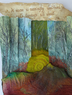
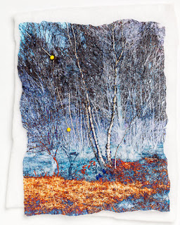
There's has been some reminiscencelately about the catalogue project that some of us undertook a few years ago. Here's my pic below and you can find out more about it by clicking on the labels (see right) marked catalogue.
It is a long process as the catalogue has to be left out in the weather for a winter. We did have fun, though.
Wednesday 13 April 2016
Friday 15 January 2016
A Little Bit of Displacement
This is a bit of a tutorial on Displacement Maps - and yes, we've been here before. The reason I'm revisiting the subject is because I have just posted the first of the free workshops (the ones that go with my new Long Diaries book) on www.d4daisy.com.
I've used this feature of Image software in the lesson and wanted to explain it further. Hopefully you will find this useful even if you don't have the book.
The lesson is based on a new piece of work in my myths and magic series and it was part of an experiment in perspective.
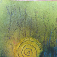
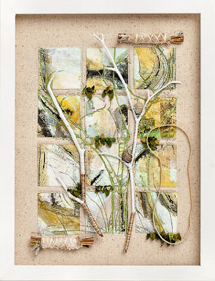
A detail of the piece is shown on the right and the trees are a printout of a computer design effect called a Displacement Maps. I've shown the technique in Paint Shop Pro and Photoshop Elements.
Paint Shop Pro
Open the image you wish to displace. Mine is a photo of a piece of silk, stencilled using the pressure stencil technique. This is where you paint fabric with wet paints - silk paints or Adirondacks or similar. The fabric needs to be saturated. Then you just place a mylar (or similar plastic) stencil on top and leave it to dry. All kinds of interesting things happen.
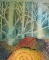
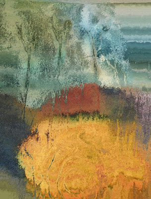
Over the top of this fabric I have laid a piece of kozo paper, which represents a maze and will eventually form the lower half of my new piece. Then I took a photograph and saved it in PSP. Let's call it Photo1. See right.
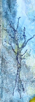
I am going to displace this image with another pressure stencil - one that turned out rather pale so I highlighted the trees with a pen. This was also photographed and saved in PSP. Photo 2. See right.
With photo 1 and photo 2 open in the program (on the desktop) make sure you click on photo 1 as the active image.
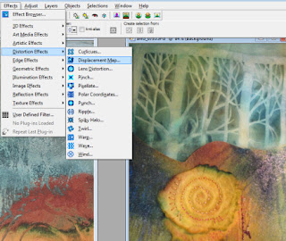
Then go to the Effects menu, slide down to Distortion Effects and click on Displacement Map.
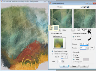
On the sub menu that appears, you will see a little box with a pic in it. The words above read Displacement Map and you will see a little arrow next to it. Click on it and select Photo2 as the map - see right.
Make sure that the Intensity is set to 100 and that 'Stretch Map to Fit Image' is selected. You can play with all the other settings at a later date.
The two boxes highlighted by the arrow will show you the effect of the map in the box on the right and also in your image.
When you click OK, the map will take effect and your image will look something like the one below left. I printed it and placed my paper on Stitch and Tear before machine embroidering the trees (see below right).
Photoshop Elements
It's a little different with Elements as you have to save Photo 2 as a .PSD file. This is the native Elements file format. Make sure you know where it is saved.
Go to the filters menu (on the top bar) and select Distort and then Displace.
You will be asked to choose a file as a displacement map. Open Photo 2.
You'll then see another box - like the one below. Try these settings which should produce a very similar effect to the PSP one. You can't check the image before applying the filter in Elements.
Do hope you've enjoyed this. If you'd like to buy the book and gain access to the free classes go to www.d4daisy.com.
Wednesday 30 December 2015
Twiddly Couching - the Movie
It's a how-to for the twiddly couching method that I used for the Treasure Keeper on the last page of my new book, Long Diaries and Tall Tales - see pic below
It is a really quick and easy way to cover a large area of background. I make the little keepers by cutting three pieces of Craft Vilene (which has had painted silk bonded to it) into triangles, making a pocket inside the front ones, at the lower edge and then inserting strands of wire, bent into a wiggly shape, like this, into the pocket.
Buttonhole round the edges and slip stitch them together before attaching your treasure. My treasure is a pair of beaded beads, given to me by my late friend, Val Campbell-Harding.
I will be putting some free classes - extensions on the book techniques- on the D4daisy Books site early in the New Year, so watch this space.
Monday 21 December 2015
Pebeo Prisme - a New Idea
The book has been launched on an unsuspecting world and I am
a happy bunny. The folk on the Workshop on the Web Members' Facebook page are
posting some of their results and it is great fun to see them all.
I had a query on the Pebeo Prisme tiles. I use these in the
book as a header bar for one of my story panels but they are great for all
purposes - I am currently working on a little
book with a patterned surface of Prisme. This will be one of the first free
lessons, early in the New Year at (www.d4daisy,com), for those who have the
book. This is how the header looks - with two inch tiles.
I use a product called Cerne relief around the edges. This dries to give a
hard raised edging to the tile and allows a deeper application of the Prisme
paint. It occurred to me that PVA might work just as well as the relief paint
and this is what I did:
Painted a thin coat of PVA over a Twinchie (mountboard square) to give a sealed
surface and allowed this to dry.
Either ‘pipe’ a line of PVA around the edge (if your PVA pot had a fine nozzle - mine doesn't) or paint a thick line of it on non-stick baking paper.
Repeat with other sides, holding the tile in the centre for
the last side (or you will get very sticky). When all sides are edged with PVA, allow to dry thoroughly.
Then rub some metallic wax, quite thickly, over the PVA edges. Gold paint would possibly work just as well, but I haven't tried it yet.
When coloured to your liking, apply some of the Pebeo Prisme paints to the centre, using a kebab or cocktail stick.
After a short time, before the paint is quite dry, prop it up against a very slightly raised surface - I've just used another tile. The paint will slowly drag as it moves a little, to give an interesting effect.
Lots more like this in the book, folks.
Wednesday 16 December 2015
New Book and Some Free Software
Thank you all for the great welcome back. The book has been printed (www.d4daisy.com) and I feel as though I can do other things.
We are really pleased with it and it has more pages than expected - the designer fell for Nina Humphreys' artwork and insisted we add a page or two. See right.
In the book, I do use the printer for some of the effects as I love the look and feel of paper and it is much stronger than you might imagine. Combining printouts with traditional drawing techniques is huge fun and I have several step-by-steps that feature this.
There isn't much use of image programs in Long Diaries as it is so difficult to find one that everyone uses. However I have found a splendid, totally free program called paint.net. It is quite free, quick to download and seems extremely stable. Just google on paint.net for details.
I think it may be more Windows-based than Mac as it a development of the very basic Paint program that comes free with the Windows operating system. It really is the easiest software for Layers, which often cause hassle. I have used this part-stitched image in the book, printed on ordinary printer paper and crumpled it has hand stitching added.
Here is a tutorial on how to do it in paint.net.
1 Go to the File Menu and select Open. Choose a
suitable image. Trees work particularly well.
Go to the Layer menu (in the top bar) and click
on Duplicate layer. Note that the image will appear in the Layers box on the
right.
Repeat Step 2 so that three layers are showing in the layers box.
Click on the MIDDLE layer so that it is highlighted.
5
Go to the Adjustment menu on the top bar and
choose Invert Colours. This will change the colours of the middle layer only
but you won’t see a difference yet.
6 In the Layers box on the right, click on the TOP layer.
At the bottom right of the Layers box is a powerful little button called properties – see
arrow. Click on this and a box will appear.
Click on the little arrow (Mode) and choose the option ‘Difference’.You will see how the
image has changed. Good
fun, eh?
9
When you have finished playing, either save in
the native format (.pdn) to keep the layers
intact, or merge them down in the
Layers menu by clicking 'Merge Layers Down'. Do this
twice to ‘flatten’ the
image and save as a .jpg.
I promised to show some ideas for making text looked distressed but I think this is enough
for now and I will be back soon with ideas for mock calligraphy.
Friday 4 December 2015
The story so far
Here I am again – just when you all thought I’d gone for
good. I do have valid reasons for the non-writing of the blog for much of this
year. There are so many excuses in fact, that I could offer you a bullet list! You have already heard some of them but I am determined to extract the maximum amount of sympathy so I'm listing them all! If
you wish to escape my hard luck story, skip to here ***.
Here is a pretty pic of a detail of some recent work to keep you going.
It has been a dispiriting year for many small businesses;
beginning with the EU inspired digital VAT disaster. This was aimed at collecting
overseas VAT from mega businesses selling online but most of those have managed
to evade it while the smaller ones – such as one person selling knitting
patterns – was caught in a bureaucratic nightmare that saw
many small businesses ceasing trading.
We had no sooner got over that than the company that
organises our credit card facilities for WoW and D4daisy changed some ‘protocols’
involving costly and time consuming work. As a result of these requirements, we
took the opportunity to restructure Workshop on the Web and that took months of
‘deeds of variation’ and form filling.
However it did involve both Fiona and Sam taking a more
in-depth role and that perked WoW up immensely. With a member-only blog and
Facebook page, we now have lots of extra content, with more workshops and
product reviews, kits for the workshops and lots of contact with members. We love
to see their work, which is classy stuff, as you can see from this pic by Mardi
Robson, based on a Lynda Monk workshop.
That was a popular kit, which included one of Lynda’s
silkscreens. We even have the odd video. All this has resulted in increased
subscriptions so WoW is safe once more.
I think everything is on an even keel again now but I have
felt as though much of this year has been spent tied to a desk or a telephone
and it was all rather depressing. In the end we have a better business model
and are more secure, so there is a silver lining.
***I have been able to get in enough stitching to produce a
new book, due out shortly. It was supposed to be out in February/March but the
work was getting finished much more quickly than expected so we decided to make
a monumental effort and publish before Christmas. It’s at the printers so
should be around next week sometime. I have so enjoyed working on it as I have
taken a new direction, with a theme of diaries and story-telling.
WoWies will recognise my long diary, subject of an article a
while ago. I had so much feedback that it prompted me to explore the theme
further in a book. It’s the story-telling that has really got me hooked and I have
been working on a theme of Myth and Legend. In addition to my own textiles, I have
included work by some of my friends and they have turned into characters in the
book. Here you can see a wonderful oil pastel work by my good friend Jane Wild.
This chap became the hero of a tale about a band of travellers,
seeking Peace Island to bring peace to the world. God knows that we need it
right now.
He rather took over the story, which resulted in a
completely different direction to the one I had planned, but he did engineer a
happy ending. It was a good ending for me too as Jane has given him to me, so I
shall get him framed very soon. I intend to pursue this theme of fantasy
through several more pieces of work and make some illustrated stitched books.
As usual there are lots of techniques one of which involves
making pressure stencilled patterns on silk. I spoke about this in my last blog but have developed more ideas. Val Campbell-Harding and I did
this for a book once, but I’ve developed it further. The beginning is very
simple – you just paint a piece of silk and, while wet, place a plastic stencil
on top. As this was for a piece about a mythical wood, I used a Clarity stencil
tree design. Putting a weight over the stencil as it dries caused interesting
effects.
I have then scanned the resulting pattern into a paint program
and worked on it by changing the colours and highlighting different areas. Such fun
and I shall be putting ‘how I do it’ posts on here and the d4daisy books web
site when the book is out.
I am really excited about continuing the theme and, as I
have an exhibition coming up at Art Van Go in March and a ‘progress’ to
Scotland in April, there will be chances to show the work. I shall also be at
Craft4crafters in Exeter in February – a busy time ahead.
Now the book is done there is a lot of catching up for
Christmas so I’m off to hit the shops. Tomorrow our unaccompanied singing group,
‘Local Vocals’, is performing at the local stately home so we will be feeling
very Christmassy after that.
I will be back soon, I promise – I’ll need to tell you when
the book is here!
Tuesday 30 June 2015
Myths, Magic and Muddle
Another long gap between blogs, mostly due to bureaucracy - hence the word muddle in the title. We decided that we should change the base of the Workshop on the Web partnership to recognise the role that Fiona (and not forgetting Sam) play. Same business - just a new name added. It involved the restructuring of practically every aspect of the business, including re-applying and being approved all over again for everything from the bank account to the taking of credit cards. It all went through OK, but they took a mighty long time to do it. It must be even harder for people with brand new businesses - at least we had a good track record. I shall spare you the unrelated saga about changing to a shopping cart system on our web page in order to offer kits. Thanks to the amazing Fiona Dix who hosts our site, we can now offer kits through WoW - our first accompanied my article on silk carrier rods (backed by metal shim).
However, I think we have made it through the dense thickets of corporate clumsiness and it may even have been responsible for a whole new design theme I am exploring. In the middle of it all I had no time for stitch so I went back to drawing.
While doodling, I drew a landscape with high cliffs, guarded by a barrier. Mysterious. Then I found, by chance, the Facebook page of Symphony of Shadows Masks - some great work there. She recommended a book, 'Mythago Wood' by Robert Holdfast and, guess what, it is all about a mysterious wood with barriers and cliffs. It is deeper than that on so many levels, working on the premise that we create our own mythical figures and settings based on old, folk memories. A tough but gripping read.
So I have started a design book, based on that book and plan a series of stitched textiles when I have finished working through the ideas I'm exploring in drawing and paint.
This page (right) represents the myth of the Green Man - a leafy creature that I am longing to stitch. If I thought about him within the confines of Mythago wood, he would become real and probably quite threatening - he looks a bit cross. The whole thing coincides rather wonderfully with some work I started in the 'Cut, Shape, Stitch' book - I invented a race of warriors and lion-like beings and they are very at home in this land of myth and magic.
I found a wonderful Pebeo paint called Prisme which gives the mottled, metallic effect in the warrior below, left.
You can also see the work in progress on some of the other pages. Many are coloured by laying stencils (some commercial, some of my own) on wet paper. Weights are placed on parts of the stencil to change the take-up of the paint. Val CH and I used to call them pressure stencils.
Blogger is refusing to let me place any of the pics where I want them - but you get the idea.
I also tried some of the Spectrum Noir alcohol markers that Sam Packer reviewed in the last issue of WoW. They come with a fine point at one end and a chisel shape at the other - great for mark-making. You can see it on the warrior's face and the landscape below him.
I used the Brother Scan n Cut to cut out a tree and, in the pic below am filling the shapes with Prisme.
This is one of the characters from the book - she enters the wood to search for her brother. I might use her for an icon-type textile - she is very suitable.
Well, that is all for now - my mythical wood calls me but I hope to be back soon.
Subscribe to:
Posts (Atom)